on Oct 2nd, 2007
Potential Site Redesign
Howdy “Dodgy Sketches Of New Site Designs” Fans!
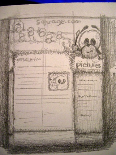
I’ve been spending a bit of time sketching out site designs for Squage.com and have finally come up with something that might just be good. Alas, its current form is that of a doodle. However, seeing as I’ve been have verbal diarrhea on this blog of late, I figured another fairly pointless post wouldn’t hurt.
So here’s the sketch:
It’s set below a sunny, grassy scene by the sea, with the content sort-of “underground” below it.
The little Squages at the top will be forming a kind of scene, with each one doing something that represents the section of the site they represent (e.g. there’ll be a Squage DJing some tunes to represent the “Sounds” section of the site).
The big Squage on the right will represent the section of the site you’re in at the moment (“Pictures” in the example above), and sits above the side bar (an “in the foreground” underground bit), with the section’s subsections listed.
It’ll be all in colour… I’m trying to go for a cartoony, fun feel to the site. It largely depends on how good I can get with CSS, I guess. Oh and whether I go mad with frustration at Paint Shop Pro 8 crashing every 5 minutes before I get it finished.
So, here goes…
Pat
